Neon signs
Glowing neon letters in any color and setting — bar signs, city windows, retro arcade text, studio backdrops.
Create stunning typographic art, text-in-image designs, and visual text effects with AI — neon signs, 3D lettering, flame text, vintage type, any style from a prompt.
Open Renoise Canvas, describe the text you want to render and the visual style — "RENOISE in chrome 3D letters on black", "Welcome neon sign in pink, rainy night", "vintage hand-lettered poster with botanical borders". GPT Image 2 delivers the strongest text accuracy and compositional control for typography work. Grok Image is fast for rapid style explorations. Midjourney V7 produces artistic typographic compositions with strong aesthetic cohesion. Always preview the output — AI text rendering improves by iterating on the prompt.
Every typographic effect imaginable — from neon signs to vintage lettering.
Glowing neon letters in any color and setting — bar signs, city windows, retro arcade text, studio backdrops.
Extruded, chrome, metallic, or glass 3D letterforms — logo treatments, title cards, and packaging concepts.
Fire typography, water, smoke, and material text effects — dramatic visual text for posters and thumbnails.
Distressed signage, chalkboard scripts, wood-type posters, and Victorian ornamental lettering.
Letters formed from flowers, vines, leaves, and natural textures — editorial and wedding typography.
Full typographic poster compositions — event posters, album covers, title cards — designed from a single prompt.
From a text description to a visual text composition — all on Renoise Canvas.
Specify the exact text you want rendered, the visual effect (neon, 3D, flame, vintage, botanical), the color palette, and the background. More specificity produces more accurate results.
GPT Image 2 for precise text rendering and compositional control — best default for typography. Grok Image for fast iterative exploration of styles. Midjourney V7 for artistic poster and editorial typography.
Review the output text carefully. If letters are malformed, refine the prompt — try shorter text, add "sharp legible letters", or switch models. Export at high resolution — watermark-free on paid plans.
Text effects, lettering styles, and typographic compositions from GPT Image 2, Grok Image, and Midjourney V7.
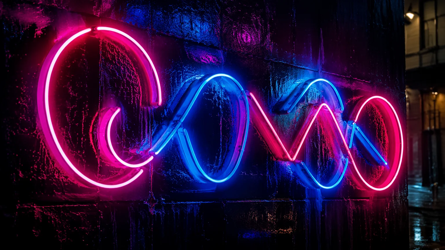
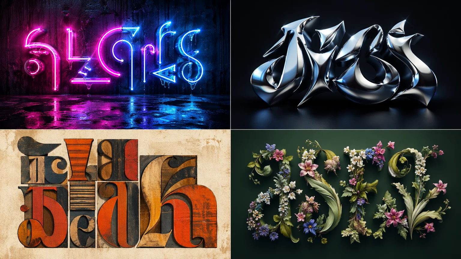
A pink and blue neon sign on a wet city wall at night — generated from a text prompt, no photography needed.
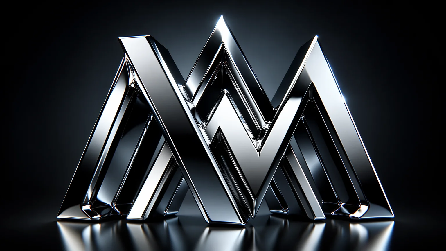
Extruded chrome 3D letters on a dark gradient — suitable for a logo treatment or title card.
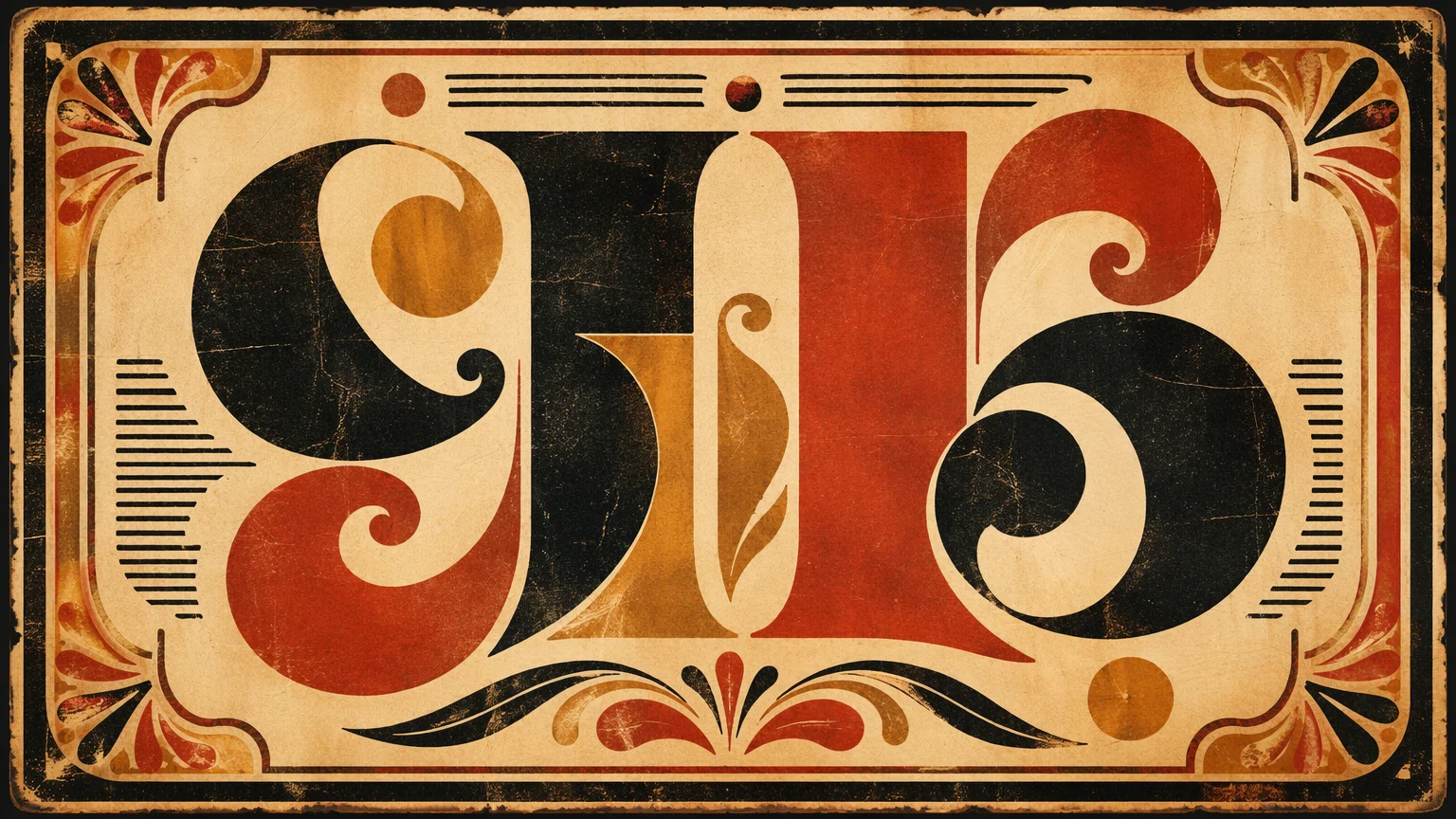
A retro wood-type poster with distressed texture, warm ink colors, and ornamental borders.
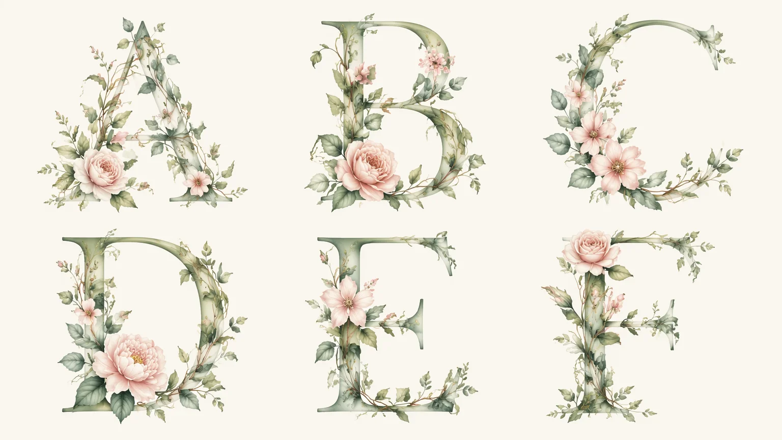
Letters woven from flowers and vines — editorial typographic art for a botanical brand or wedding piece.
Text rendering is one of the historically harder tasks for image generation AI. Early models would produce plausible-looking letterforms that dissolved into gibberish on close inspection. GPT Image 2 and Grok Image represent significant improvements — both can render short, legible words with reasonable fidelity when prompted carefully.
The approaches that work best: keep the text short (1–4 words is far more reliable than a full sentence), specify "sharp legible letters" or "clear readable text" in the prompt, and use a high-contrast background against the text color. For neon signs, neon lettering on a dark background tends to render more accurately than text on a complex scene. For 3D and metallic text, simple sans-serif letterforms produce cleaner results than ornate script faces.
GPT Image 2 currently leads on text accuracy — it follows precise letter-by-letter instructions more reliably than other models. If you need a specific word rendered correctly, start with GPT Image 2. Grok Image is faster and good for exploring stylistic directions where perfect letter accuracy is less critical. Midjourney V7 produces the most aesthetically impressive typographic compositions — evocative poster design, atmospheric lettering — but text accuracy can vary; iterate on the prompt if letters are malformed.
For complex typographic design — precise kerning, specific font faces, controlled hierarchy — a dedicated design tool (Figma, Photoshop, Illustrator) with real type rendering will always be more reliable. AI typography works best for decorative and effect-heavy text where stylistic impact matters more than typographic precision.
Three image models optimized for different text art use cases, on one canvas.
Strongest text accuracy for short words and phrases — neon signs, 3D text, and precise typographic compositions.
Fast iteration for exploratory text art and style testing before committing to a final direction.
Artistic typographic poster compositions with strong aesthetic cohesion — evocative and editorial.
Prompt, compare models, iterate on text accuracy, and export — all on one visual workspace.
One plan unlocks GPT Image 2, Grok Image, Midjourney V7, and every other model on Renoise.
Neon signs, 3D lettering, flame text, vintage type — any style from a prompt.
GPT Image 2 currently produces the most accurate text rendering for short words and phrases. For best results, keep text to 1–4 words, specify "sharp legible letters" in the prompt, and use high contrast between text and background.
AI image models generate pixels rather than rendering fonts, so text accuracy is probabilistic. Shorter text, clearer style descriptions, and high-contrast setups produce more reliable results. If letters are wrong, regenerate with a slightly adjusted prompt — or switch to GPT Image 2 for better text accuracy.
Yes. Describe the text, the neon color(s), and the background — "LUNA in warm amber neon, mounted on a dark brick wall". GPT Image 2 handles short business names (1–3 words) reliably. Longer phrases may require iteration.
Yes — images generated on Renoise are yours to use commercially. Review the terms of service for full usage rights. AI-generated typography works well for social media graphics, thumbnail art, poster concepts, and web visuals.
For print-style posters use 3:4 or 4:5. For social media use 1:1 (Instagram square), 4:5 (Instagram portrait), or 9:16 (Stories/Reels). For wide banner and title card compositions use 16:9.
Not for precision work — specific font choices, exact kerning, or complex typographic systems are still better done in dedicated type tools. AI typography is most useful for decorative, effect-heavy visuals where stylistic impact matters more than typographic precision, and for fast ideation and concept exploration.