Gig and event posters
A night, a date, a venue. The most common shape, and the one the styles are tuned for.
Type the words that go on the poster, pick a style, and get a finished portrait piece with the type set into the illustration rather than floating on top of it.
Follow us and get 20 free credits — about 6 images
Latin-alphabet typography only on this tier. Chinese, Japanese and Korean characters come back unreliable.
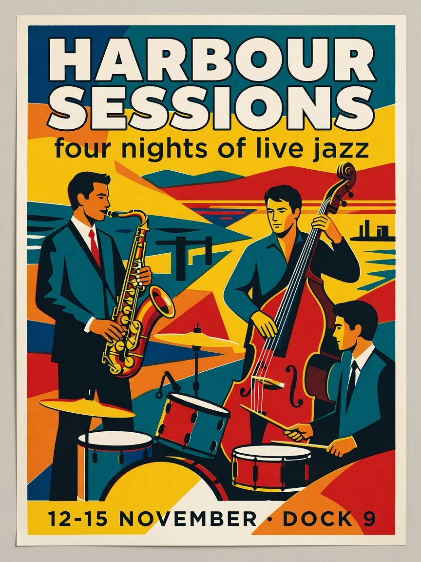
"HARBOUR SESSIONS" as the headline, "four nights of live jazz" beneath it, and "12-15 NOVEMBER · DOCK 9" along the bottom — Retro screen-print
A real run from this page, at this page’s tier.
Subscribe for more credits and more models.
Type the words that need to appear — a short headline, one supporting line, one line of practical details — pick a style, and generate. You get a finished portrait poster in about fifteen seconds, with the type set into the illustration rather than laid over it, so there is no design step afterwards. Following us on X and YouTube earns 20 free credits and a run here costs three, so your first six posters are free; after that each one is billed per image.
Making a 16:9 thumbnail rather than a printed piece? Use the YouTube thumbnail generator
The common thread: the words already exist and the artwork does not.
A night, a date, a venue. The most common shape, and the one the styles are tuned for.
Opening hours, a seasonal menu, a weekend market — printed at A3 and taped in a window.
A cheap, popular corner of this search: give it a title and a tagline and let the style do the rest.
A travel or type poster for a wall, generated at the size you want rather than bought at the size someone chose.
Step one carries almost all of the outcome. Structure beats volume.
A headline of two to four words, one supporting line, one line of details. That structure is the reliable zone.
Six looks, from retro screen-print to Swiss minimal. This drives the composition, palette and type choice together.
Read every line at full size before you print. Re-run if a word broke — a second attempt costs three credits.
From our own runs, including the ones that failed. Almost everything here comes down to how much text you asked for and in which alphabet.
| What you ask for | Expected result | What to do |
|---|---|---|
| Headline + one line + one detail line, in English | Best case — all three lines correct, set into the artwork | Nothing needed; this is the tuned shape |
| A named visual subject as well as the copy | Strong — "a jazz trio", "a cliff railway" get composed into the design | Mention it in the same box as the words |
| A paragraph of body copy | Type shrinks, layout gets crowded, and errors start appearing | Cut to three lines; a poster is not a flyer |
| Chinese, Japanese or Korean text | Unreliable — we saw a character come back wrong in testing | Use the Images surface, where stronger text models are available |
| Your own photo in the design | Not possible here — this page takes text only, no uploads | Use the Images surface for anything involving your own images |
| An exact brand font, logo or hex colour | Not controllable — the model picks type and palette from the style | Generate the artwork, then set brand elements in a design tool |
All four came out of this page’s own model and tier on 2026-08-25, first attempt each.
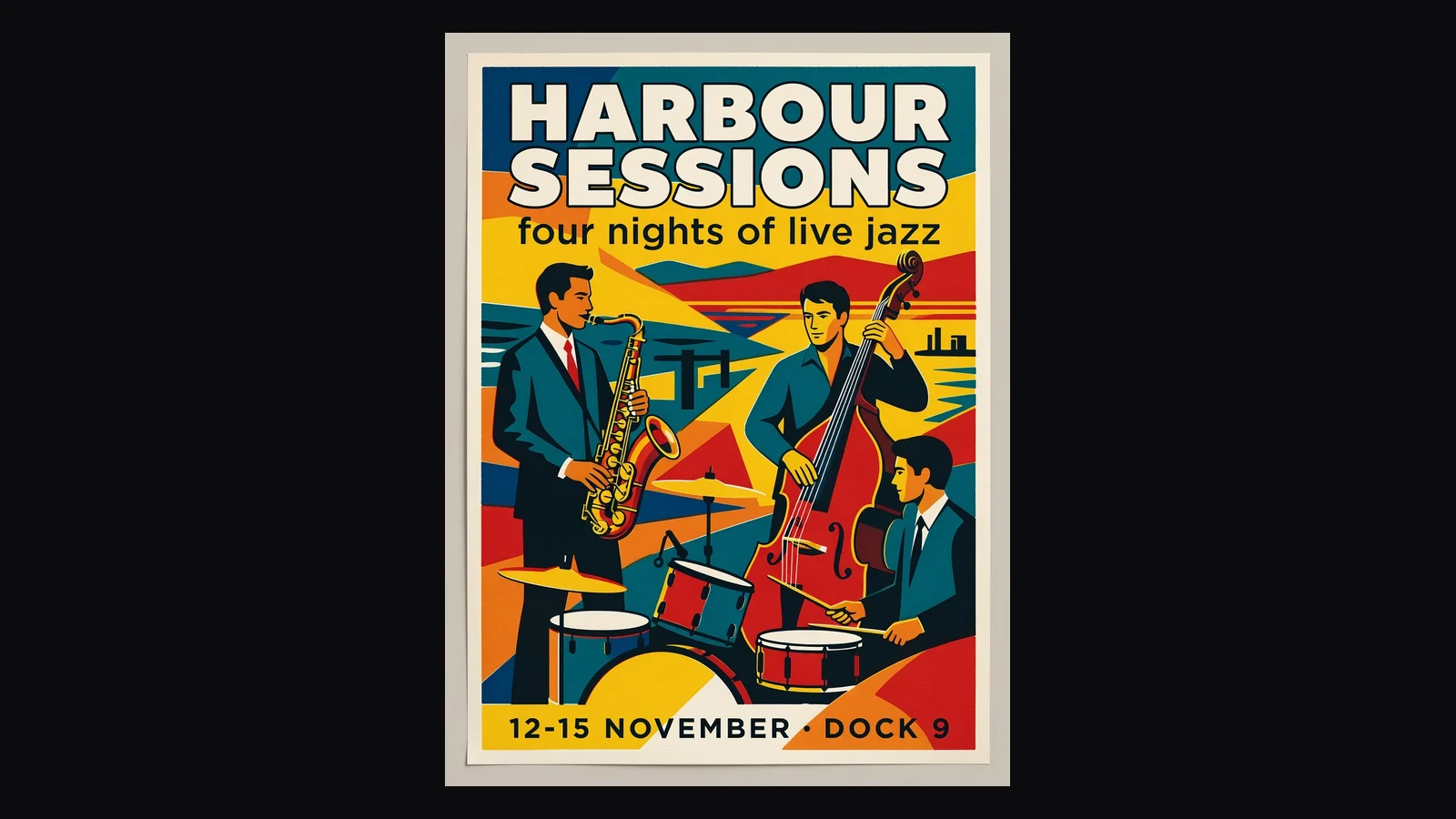
“HARBOUR SESSIONS · four nights of live jazz · 12-15 NOVEMBER · DOCK 9”.
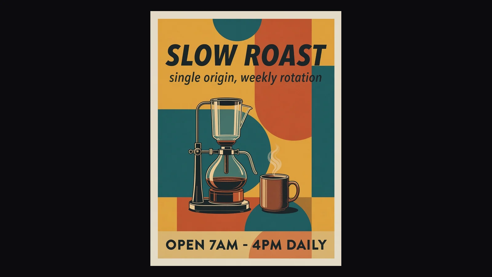
“SLOW ROAST · single origin, weekly rotation · OPEN 7AM - 4PM DAILY”.
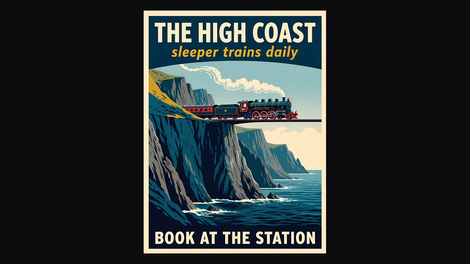
“THE HIGH COAST · sleeper trains daily · BOOK AT THE STATION”.
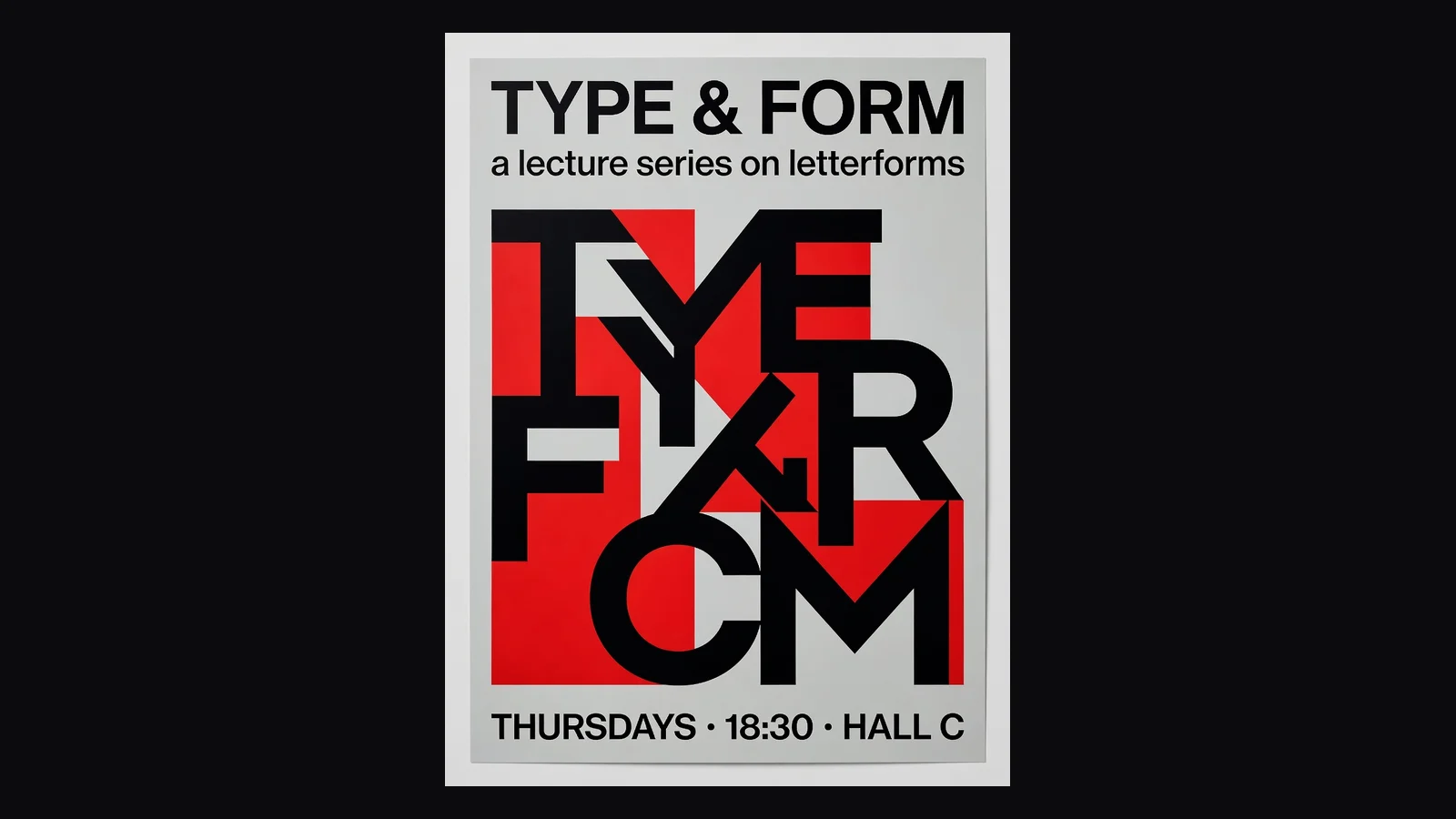
“TYPE & FORM · a lecture series on letterforms · THURSDAYS · 18:30 · HALL C”.
Here is something we found out by testing rather than by guessing, and it explains most of the disappointing results people get from AI poster tools.
If you hand an image model your poster copy the way you would hand it to a designer — headline, subheading, body line, "make it a poster" — what comes back is usually a cream rectangle with your words set on it in a competent sans-serif. The spelling is perfect. There is no artwork. It is a text slide, and it is technically exactly what you asked for: you described words, so you got words. We ran that experiment three times and got the same thing three times.
The fix is not a better model, it is a better instruction — and it is the half of the instruction that a person who wants a poster does not know to write. A poster needs to be asked for as a printed object: a composition, an illustration filling the frame, colour blocking, type integrated into the artwork rather than sitting on it. When we wrapped the identical copy in that framing, the same model on the same tier returned finished screen-printed, mid-century, vintage-travel and Swiss pieces, four out of four, with every line of type correct.
That scaffold is what the style buttons on this page are. You write the words; the style supplies the composition language. It is also why the results here look different from typing the same sentence into a general image tool — not because the model is different, but because the request is.
The practical rule that falls out of the same testing: three lines. A headline of two to four words, one supporting line, one line of details. Push past that and the type shrinks to fit, crowding rises and mistakes start to appear. A poster is read from across a room, so the constraint is a design truth as much as a model limitation — but it is a hard limit here either way.
Both comparisons show up in the related searches for this term, so both deserve an answer rather than a shrug.
Canva is the incumbent and it is genuinely good at this. Templates, your own photos, your brand font, your exact hex, precise control over every element — and you do the layout. That is the right tool when the poster has to match a brand, include a specific image, or be edited again next month. It is a slow tool when you have three lines of copy, no photo, no brand kit, and an event on Friday.
ChatGPT will make you a poster image and, in our experience, will make you a text slide for exactly the reason described above unless you already know how to ask. You can get there — describe the composition, the palette, the illustration style, the placement of each line — but at that point you are writing the scaffold by hand every single time, and you still have no repeatable style you can pick again next week.
This page is the narrow one. Six styles, three lines of copy, fifteen seconds, six free runs, portrait output ready to print. What it will not do is put your photo in the design, match a brand font, or hit an exact colour — all three are real limitations rather than things we are being modest about. If any of those matter, generate the artwork here and finish it in a design tool, or work on the Images surface where reference images and stronger models are available.
The facts before you spend a credit:
Illustration and typography generated together, ready to print or post as-is.
One run, one poster. Trying another style is another run, not another wait.
20 credits for a follow, three per run. No free plan and no trial — a one-time grant you spend how you like.
English and other Latin-script languages are reliable here. CJK characters are not, and we say so rather than let you find out at the printer.
Unlock every image model — and the video models on the same canvas — on one plan.
For first-time AI content creators
Billed $168 annually
Upgrade PlanSave $72/year
For creators shipping content every week.
Billed $504 annually
Upgrade PlanSave $216/year
For studios and pros producing at commercial scale.
Billed $1680 annually
Upgrade PlanSave $720/year
For first-time AI content creators
Billed monthly
Upgrade PlanFor creators shipping content every week.
Billed monthly
Upgrade PlanFor studios and pros producing at commercial scale.
Billed monthly
Upgrade PlanRenews automatically each year until canceled.
Renews automatically each month until canceled.
Upscale the poster for A2, or open the Images surface for reference photos, brand assets and stronger text models.
Following us on X and YouTube earns 20 free credits and a run here costs three, so your first six posters are free. After that each one is billed per image. There is no free plan and no trial — the credits are a one-time grant, and no subscription is needed to spend them.
Because you described words, so you got words. Image models take a poster brief literally: hand one a headline and a subheading and it will set them neatly on a blank ground with no artwork at all — we reproduced that three times out of three in testing. A poster has to be requested as a printed object, with a composition, an illustration and type integrated into it. That framing is what the style buttons on this page add for you.
Three lines is the reliable shape: a headline of two to four words, one supporting line, one line of details. Beyond that the type shrinks to fit, the layout crowds and spelling errors start to appear. If you need a paragraph, you are making a flyer, and this is the wrong tool for it.
Not on this page — it is text-to-image and has no upload slot. Anything involving your own images belongs on the Images surface, where reference photos are supported.
No. The model chooses the typeface and palette from the style you picked, and there is no way to specify a font file or a hex value. For brand work, generate the artwork here and set the brand elements over it in a design tool.
Not on this tier. We tested a Chinese headline and one character came back wrong — the kind of error that is easy to miss and expensive at the printer. Latin-alphabet languages are reliable. For CJK typography, use the Images surface where stronger text-rendering models are available.
Yes, and it is one of the more popular things people ask this kind of tool for. Give it a title, a tagline and a line of credits in the three-line shape, and pick a style that suits the genre — retro screen-print and art deco both work well for it.
Portrait format at the 1K tier, which is fine for social posts and small prints. For anything A3 or larger, run the result through the image upscaler first — it is a flat one-credit pass and it is what that tool is for.